By Design?
How Design Harms and Confuses Consumers in Digital, Finance Products
written and researched by Caroline Sinders, co-founder of Convocation Research + Design
published October 12, 2025
Have you ever thought you’ve unsubscribed from an email but found you're still subscribed? Or canceled a subscription but still got charged? Or, perhaps, you are shopping online and thought you selected one item, only to find that a smaller item was added automatically to the bag, too. All of these examples are a part of a specific design phenomena called ‘harmful design patterns.’ Harmful design patterns, often referred to as dark patterns, deceptive design patterns, anti-patterns, manipulative design patterns, online choice architecture, are design patterns that unintentionally or intentionally trick, manipulate, nudge, confuse or direct a consumer to make a decision they did not intend to make, and often that decision benefits the company, and not the consumer. Harmful design patterns are prevalent across the internet, and across all different types of products, domains, websites and shops. They can be found anywhere and in any language, geography and region. But, the majority of academic and civil society research tends to focus on e-commerce and privacy related harmful design patterns.
With financial support from the Interledger Foundation in their 2025 ambassadorship cohort, I spent 8 months conducting a broad literature review, systemic mapping of the ecosystem, design analysis and light weight user interviews focusing on harmful design pattern, confusion, friction and barriers in financial service platforms, while also analysing how does design impact digital financial inclusion. In this project, I observed four users who are creatives and freelancer immigrants in the UK and who send money back home to South America, while also sending and receiving money across the UK, Europe and Asia as a part of their freelance practices. Additionally, I spoke to former and current regulators in the US and the UK, I interviewed financial experts, harmful design patterns experts, and users of different traditional banks, neo-banks, and financial service platforms in an effort to map out and understand the emergent landscape of harmful design patterns in the financial services space, and design’s impact on digital financial inclusion.
Chapter 1
Finance Impacts Everyone
Harmful design patterns inhibit a person’s agency, and their ability to fully have choice, control and consent in regards to every aspect of their daily lives, from how they spend their money to how they make choices about their privacy. But, I’d like to argue something more here, that the harm is more nefarious, by impacting users asymmetrically. In a paper by Princeton University on harmful design patterns, they described how harmful design patterns impact user’s welfare by causing financial loss, invasion of privacy and creating cognitive burden. Similarly, University of Washington Law professor Ryan Calo echoed something similar; that harmful design patterns can result in three kinds of harm typologies: economic harm, privacy harm and vulnerability as autonomy harm. But, moreso, harmful design patterns impact users disproportionately as well. In a study conducted by the European Union, they found that “vulnerable consumers were more likely to make inconsistent choices (50.89%) than average consumers (47.24%).” Vulnerable, in this context, was used to describe users navigating the web in a second or third language, older users or those newer to technology.
The same European Union study found that around 97% of the most popular apps and websites visited or used by European consumers had one or more harmful design patterns present.This same study found that if a user had a background in user experience design or had already heard the term ‘dark pattern’, that user could more easily identify harmful design patterns. A person should not have to have a background in digital design, or only navigate the web in their first language to be able to exercise their consent, and agency. But I present these harms to illustrate this pervasive problem: harmful design patterns are so incredibly common across the internet, impacting all users and their everyday lives. Harmful design patterns do increase cognitive burden, and add confusion to processes by elongating them, making important content small or difficult to access, or adding other unnecessary points of friction, that all impact users. When an already arduous process or complex area of knowledge is made even more confusing, the harm falls onto that user, and it can be even more destructive.
Send Money
Finance is one of a user’s most intimate, important, and often, confusing areas of their lives
This brings us to the question “why focus on finance and financial service platforms and harmful design patterns?” The answer is, how could we not? Finance is one of a user’s most intimate, important, and often, confusing areas of their lives, and that’s even before we get to the software and companies they are. Drawing on what could be described academically as ‘anecdotal data’ but these are real observations and conversations from our friends, communities and colleagues, which is finance is so difficult to understand, and most people we spoke to felt like they didn’t have enough guidance, advice or knowledge in navigating their own finances and financial futures. Finance can feel difficult to understand as there are so many moving components to it, like what are the best banks to bank with to save money, how is the best way to save money, what pension plans are open to me, how can freelancers and artists best save money, what are the best ways to send money internationally with low cost fees, what are normal fees for banking generally, when should I start investing in stocks, how much money do I need to invest in stocks, what should I invest in, is crypto a good way to make and save money, what’s the best app for budgeting when I’m underpaid and clients are delayed in fulfilling invoices, and the list goes on and on. Financial service platforms, including traditional banking, are wrapped up in this ecosystem of worries, concerns, questions, and advice our communities are seeking in regards to finance generally. Similar to navigating any tax, medical, or other bureaucratic systems, the design of any financial service platform is a part of this complex, emotional and very thorny part of a real user’s life, which is their money, and their financial habits.
Why focus on finance and financial service platforms and harmful design patterns?

‘Unfriendly Design’
Any design on top of these domains is already going to be complex for users to understand, even with the best design and the most user friendly company. Traditional banks, for example, are balancing regulatory requirements and constraints, along with verifying all different types of information to protect customers from frauds, scams, and user error, like sending money to the wrong person. All of these constraints and concerns need to be packaged into a user friendly and navigable system designed for all different types of people and backgrounds, but it also has to disclose different types of liabilities and legal framing to the customers, as well. Even moreso, finance comes with its own set of technical jargon, often which can be opaque to users who are new to finance. For example, in one of our user testing sessions, one of our users, Cala, was sending money from her Chilean traditional bank account to a traditional bank in the US. “What is an ACH?” she wondered. Her bank asked for the receiver’s ACH number to be able to send the payment, but the interface didn’t explain what an ACH was. During the user interview, I interjected in an attempt to help clarify, saying it was either an account number or routing number but I couldn’t remember which. A quick Google search explained it’s related to routing numbers. In this instance, Cala’s traditional bank in Chile could have utilized a small, clickable UI on their interface that when touched, could have opened a small interstitial explaining what an ACH was. This small change would be incredibly pro user, and could help in guiding Cala to more easily make the right decision within the banking app and not have to leave the app to seek more information. While this is not a harmful design pattern, it is an example of ‘unfriendly design’ or bad design for the users. The interface is working against the user by assuming the user remembers specific financial jargon, as opposed to helping explain and support the user within the design of the interface itself.
![]()
Chapter 2
Harmful Design Versus "Bad" Design
Harmful design patterns are not just ‘bad’ design, or design that a user simply doesn’t like. They are truly manifestations of design that can trick, confuse or manipulate a user into making a decision they normally wouldn’t make, and they can occur across many levels of a product, from how the code base is written to what the user directly and visually sees. Sometimes, harmful design patterns within products even give different users different results, outcomes or specialized offers depending upon data that’s been gathered about individual users. This is a type of invisible harmful design patterns. All of these different “tricks”, from code based harmful design to invisible changes that a product makes to a consumer to visual harmful design, make it arduous and difficult, if not impossible in some cases, for a user to avoid falling for harmful design patterns. Often, visual or choice based harmful design patterns are subverting a user expectation within the design or design pattern. The patterns in the name ‘harmful design patterns’ or ‘dark patterns’ are key to understanding them as a phenomena in regards to choice. Harmful design patterns are a form of design patterns; however, unlike harmful design patterns, design patterns are supposed to benefit users and to help create usable and accessible products. Design patterns are a key part of technology design; design patterns are “reusable/recurring components which designers use to solve common problems in user interface (UI) design, such as navigation menus for webpages or mobile devices.
Design Patterns

Normal Design Patterns
Normal design patterns are created to benefit users by centering design principles such as minimalism, consistency, efficiency within a product. Online interfaces should reduce users’ cognitive load by reducing “the amount of mental resources that is required to operate the system” and make it easy to use a product. Design patterns reduce unnecessary friction and make it easier for users to use products or engage in a particular task or action. “Good” or pro-user patterns can help limit or ease the cognitive burden of engaging with a product.
Harmful Design Patterns
Harmful design patterns subverts the normal design patterns to create harm and trickery, such as this Vimeo example where three buttons are clearly presented and one button is presented just as text (it’s not lost on me that the ‘free’ option button is the one that does not have a button outline around it). In this example, a user expects all of the choices to be rendered as buttons.
A Quick Primer on Harmful Design Patterns Research
There are a variety of different types of harmful design patterns like difficult to unsubscribe or hidden subscription traps, unintended purchases ‘sneak into baskets’, privacy related tricks that nudge consumers to disclose personal information or data like handing over an email or phone number, a button to emphasize click on allowing cookies, design that exploits a user’s attention and maximizes engagement longer than a consumer intended or would have chosen to on their own, and many others.
Types of harmful design
All of these different types of harmful design patterns might have different, specific names depending upon the paper or taxonomy one reads. “Sneak into basket” might also be called “sneaking” or bait and switch, hidden costs, hidden legalese stipulations, hidden subscription, or even drip pricing. Sneak into basket, in some cases, might only describe a product being snuck into an e-commerce shopping basket, but the same act of ‘sneaking’ or hiding information like hiding in a subscription sign up (hidden subscription) or sneaking new costs into the check out flow (drip pricing) are describing the same action as sneak into basket. Some researchers might call ‘hiding information’ a form of interface interference, which “is a strategy which privileges specific actions over others through manipulation of the user interface, thereby confusing the user or limiting discoverability of relevant action possibilities.”
Match the Dark Pattern
Drag a harmful design patterns name onto its correct definition. Test your knowledge before diving deeper.
Patterns
Confirmshaming
Default Settings
Sneak into Basket
Bundled Consent
Biased Framing
Definitions
What makes a Dark Pattern?
There are many different types of harmful design patterns out in the world, and many papers that outline all of these different types and taxonomies of harmful design patterns. The canonical paper, “What Makes a Dark Pattern Dark”, combined 19 different taxonomies into one large, comprehensive harmful design patterns taxonomy. It’s important to note that each taxonomy might come up with their own naming structure, or sometimes reuse identical names from other taxonomies, but generally, these taxonomies are identifying the same types of harmful design patterns, even if there are different names for them. Some taxonomies, such as Colin Gray, Cristiana Santos, Nataliia Bielova, and Thomas Mildner’s paper “An Ontology of Dark Patterns: Foundations, Definitions, and a Structure for Transdisciplinary Action” creates different groupings of types of harmful design patterns, that look at very broad similarities (called high level patterns) that then funnel into smaller groups (meso level patterns) and then the smallest groups, the low level patterns. For example, a type of harmful design pattern like ‘interface interference’ has 8 meso level patterns within it, and then 8 low level patterns within that.
While the majority of papers focus on harmful design patterns examples that draw directly from e-commerce and privacy areas, any of the taxonomies can be applied to any particular area or domain. Interface interference, hindering, forced action, defaults, drip pricing, overloading and so many others can be found not just in e-commerce products or interfaces related to privacy, but also in financial service products, social media, entertainment, and any other domain. A joint paper by the UK’s Competition and Markets Authority (the CMA) and the UK’s data protection regulator, the Information Commissioner's Office (the ICO), shows this well by illustrating how five different types of harmful design patterns could impact online competition, consumers, and data protection. These five types of harmful design patterns, “harmful nudges and sludge”, “confirmshaming”, “biased framing”, “bundled consent” and “default settings”, tend to be documented in e-commerce or online shopping examples, but this paper also showed how these same types of harmful design could impact privacy and data regulation in digital products, as well.
Chapter 3
Harmful Design Patterns in Finance

When we started this research back in February 2025, we expected to find pre-existing types of harmful design patterns but applied to financial service platforms, and we anticipated finding some potential new harmful design patterns relevant or specific to financial service platforms, and we found examples of both. Our research uncovered how some financial service platforms engage in pre-existing harmful design patterns like misrepresenting fees, which could be labeled as “hidden information”, “drip pricing”, “hidden legalese”, “bait and switch” and other types of harm. But, our research also uncovered other types of harmful design patterns that, one could argue, are more specific to financial services and prey upon a consumer’s confusion or lack of financial knowledge of how traditional banks differ from other financial platforms, neo banks, and money lending apps. This confusion could be, and is sometimes, weaponised by financial service platforms, where they will hide information about their data retention services and general financial protection, and nudge users into accepting hidden fees, making deleting the service difficult and a variety of other harms.


We’ve Seen it Before: Manipulative Interfaces and Hidden Fees
Hidden fees, and interfaces that trick or nudge users to spend more money on the platform or give money away to the company are not new, sadly. The Dark Patterns Tip Line has examples of online webstores opting consumers into more expensive shipping, airlines nudging users to purchase more expensive seats by presenting those seats as ‘normal’ seats, and examples of hidden and bundled fees from food delivery services and ticket sellers . In our research, we uncovered similar types of harmful design patterns of hidden fees and tricky interfaces in various financial service platforms. Some companies, via marketing and advertising, portray their products as free services but then hide the actual costs later on when a user is already signed up and using the app. SoLo Funds, for example, misleads both borrowers and lenders. SoLo Funds is a ‘community’ or peer to peer lending fund, in which users can sign up to lend people money (as lenders) or sign up as borrowers to borrow money. For borrowers, SoLo Funds has used advertising to portray their loans as having no interest , or no fees but actually have large fees for late payments for the borrowers, and an instant withdraw fee to a debit card . SoLo Funds also misleads lenders as lenders do not collect any late fees , which can lead to them receiving less money than what they originally lent , according to numerous Reddit posts from SoLo Fund lenders.
Other types of harmful design patterns utilized by SoLo Funds are defaults or pre-selection, as SoLo Funds has a pre-selected tip or donation with no options for zero tipping. This tipping feature is marketed as ones where the community can tip each other, and also includes a donation to SoLo Funds. According to Reddit, the app turns on the donation to SoLo Funds, and a user has to go to their settings to turn it off. Otherwise, the donation seems to be automatically added, and with some borrowers assuming the automatic donation goes to the lender. It’s the tip that goes to the lender or community, and the donation goes to SoLo Funds, but it’s not clear in the UI that this is occurring. This UI that offers no visual way to opt out, is pre-selected and not clear who is the real recipient, are types of harmful design patterns called nudges, defaults, and pre-selection.
Products like Chime, where they have marketed themselves as having no hidden fees, but Chime actually has immediate transfer fees, are other examples of harmful design patterns. Simon King, a design expert and technologist formerly of the Consumer Financial Protection Bureau, unpacked in an interview how the immediate transfer fees can feel a bit disingenuous, especially for money lending apps. Simon described, “The use case for it is making ends meet. And generally, when you're in a bad situation, and you've realized you don't have money to buy groceries, and you might even [be] at the grocery store. You're not waiting two days.” Hidden fees, aside from being harmful design patterns, impact vulnerable consumers, especially in short term loan contexts. Those consumers need those loans and they need them fast; not all consumers can wait two days or a week for a payment to clear. For something like a loan, the immediate transfer is the more likely option most people will take because they need that loan. Even if there is a free option of waiting a few days for the loan to hit, that free option isn’t really the option most users will take. This is what makes the type of marketing of Chime not just disingenuous but also predatory, their users were marketed to about these free services, but the service they need, the immediate transfer, costs money. Similar with SoLo Funds, users were marketed no interest loans, and sold on the idea of a community, and they were met with friction, multiple types of hidden cost, and an app that automatically opts them in to donating back to SoLo Funds.
Dark Finance
One paper, “Dark Finance: Exploring Deceptive Design in Investment Apps”, which focused on investment apps in the Norwegian market, documented other types of established dark patterns but in financial services, found similar harms. The authors analyzed 26 apps that allow consumers to purchase stocks, funds, and cryptocurrencies. These apps spanned traditional banks and other kinds of financial service platforms; the paper generally found that the traditional banks did not engage in harmful design, while the other apps did. This paper found different harmful design patterns present in some of these apps, such as forced registration, hidden information, false hierarchy, hidden cost, defaults or forced action, forced continuity, social proof, hidden or disguised ads, and bias framing or aesthetic manipulation. It’s worth noting that the context of some of these occurrences deeply matters. For example, it’s not unusual for a traditional bank to require ‘registration’ to engage with the different products and services. While ‘forced registration’ is often where users are required to sign up, or hand over some personal data (like an email or telephone number) to access content, a traditional bank would generally not hide any information about its services, its costs, what they offer, etc behind a forced registration. But, it wouldn’t be unusual for a bank to require a consumer to sign up for the bank, have that account approved and verified for the consumer to then log onto the bank’s platform and engage with its services. A harmful design pattern with forced registration, in an e-commerce example, would be not allowing a consumer to peruse or see content or goods on the platform until they sign up for the platform. In a financial services context, for forced registration to be harmful design, key information that’s hidden from the user and only accessible via sign up or handing over personal data like an email or phone number would need to occur. This ‘key information’ would need to be information about the platform that the user could not find out otherwise or information that impacts a user’s decision about using the platform, pricing, services or other offerings. Generally, traditional banks do offer up all of this information to prospective clients. However, if a financial service provider such as a trading platform only allowed a consumer to understand their product and service offerings after giving up their email, that would be forced registration and a harmful design pattern. But, as I said earlier, luckily the paper, “Dark Finance: Exploring Deceptive Design in Investment Apps,” found that traditional banks did not engage in harmful design patterns; it was the other apps, like cryptocurrencies and financial service platforms, that used these harmful tricks against consumers.

When Knowledge (Or Lack Thereof) Turns into Harmful Design
Some of the findings from “Dark Finance: Exploring Deceptive Design in Investment Apps” tugged on something related to our next theme, even if it wasn’t explicitly covered in their paper. In this research, we are proposing this as a new form of harmful design pattern: that the lack of disclosures that financial service platforms (or non traditional banks) have in terms of how they are not traditional banks, and what those differences mean, are forms of harmful design patterns. There are aspects of security and protection that a traditional bank can offer, and only some financial service platforms (e.g NOT traditional banks) can match. But understanding the liabilities, safety concerns, security, of what it means to be ‘banked’, all require different types of financial knowledge from the consumer to adequately assess risk, and assess harm. In this circumstance, how would a consumer understand that some types of drip pricing or hidden prices a la Chime via short term loans would be a harmful design pattern and a predatory one, when compared to the different types of fees from traditional banks, like overdraft fees, monthly service fees or using another bank’s ATM. To a consumer, fees are fees, but generally traditional banks will disclose the types of fees they have for consumers before they sign up to a platform. Whereas, a hidden fee from Chime is a harmful design pattern because it wasn’t disclosed to the consumer. Already, this is a lot of information for a consumer to parse, memorize, and use to assess what is a trustworthy or untrustworthy financial institution to use.
Financial services and financial information can be incredibly difficult to understand, particularly what traditional banks offer, how they are insured, and what protections they have versus what financial services platforms do not offer, what protections they cannot extend, etc. The “Dark Finance: Exploring Deceptive Design in Investment Apps” paper noted that “platforms, also known as shadow banks (i.e., non-banks), do not offer standard customer services like bank accounts, loans, or credit cards but provide platforms for trading securities.” Traditional banks do offer these services, and also provide a physical space or footprint for the bank. To further add confusion to the matter, not all financial services are equal, in their merits or in their weakness, and they all offer different things. Chime, which does have harmful design patterns, has expanded to offer a debit card, a service called a ‘credit builder’ and a checking account. The best way to describe Chime is that it is a ‘neo bank.’ To be very clear, not all neobanks are bad, or have harmful design patterns, or predatory loans. In section 4, we will cover more about neobanks, and their pros and cons.
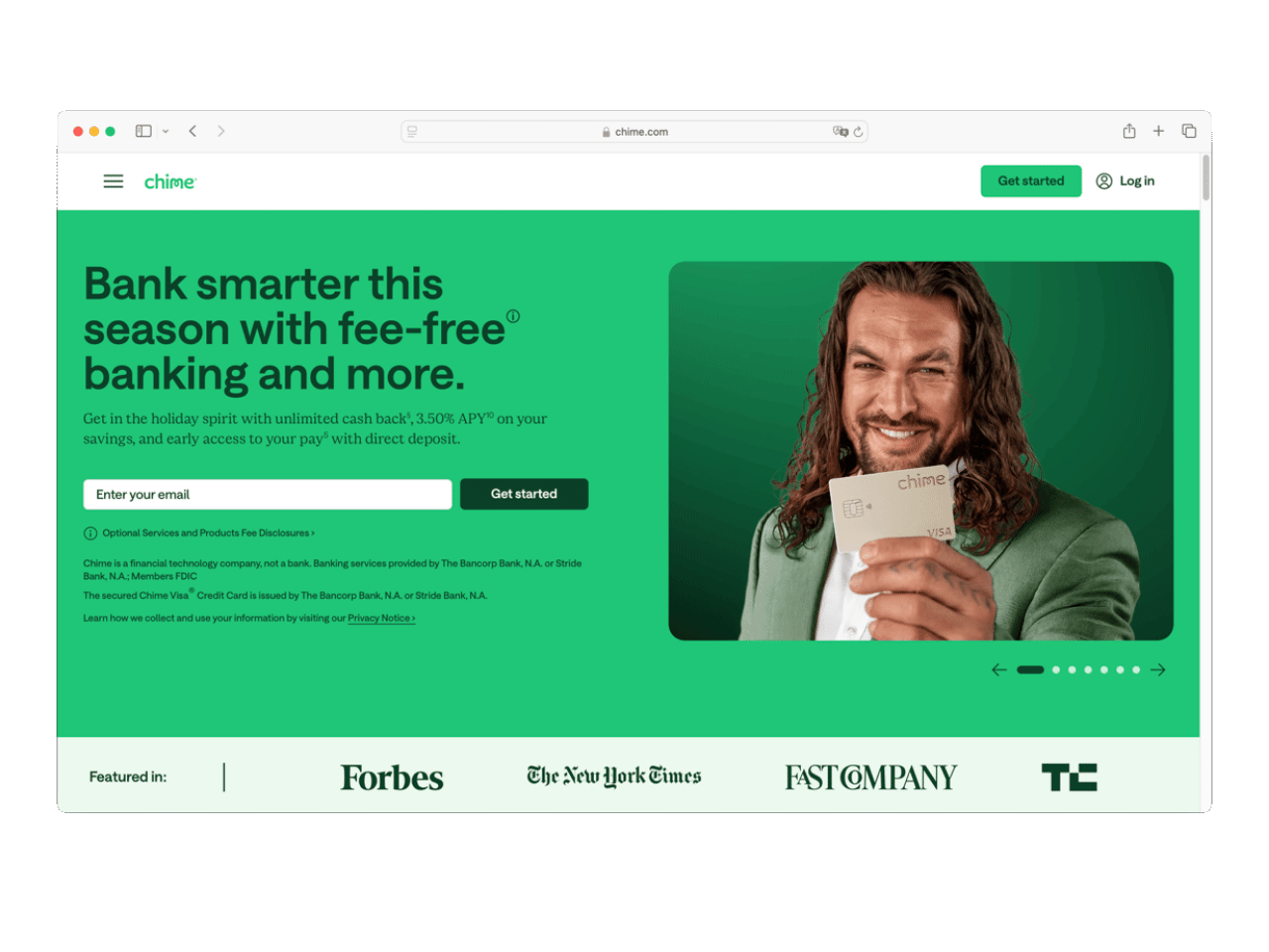
This lack of prominent disclosure when visiting financial service platforms that they are not traditional banks, and what that means, and how that lack of disclosure can confuse users can be best seen on Chime’s website. Visiting Chime’s website, one is immediately greeted with language about banking, splashed across a marquee with headlines like “Everyday, fee-free banking” and “The #1 most loved banking app!” The use of banking over and over again, the mentioning of Chime’s debit card, and checking accounts, gives the feel that Chime is like a bank, if not a bank. By pushing its financial products, like a debit card, and checking account, which are not harmful design in and of itself, but those are products a consumer would associate with a bank. For example, a financial service platform that only allows trading or selling stocks or cryptocurrencies, might not ‘feel like’ a bank because there’s no checking account or debit card. A consumer would really need to know that the lack of a savings account, and a lack of a credit card, means Chime is NOT a traditional bank. That same consumer would need to do background research to understand more about Chime, and how it compares to other banks. But, going back to Chime’s website, a consumer would have to read the very tiny print on Chime’s website that says it's not a bank. This is something any consumer but especially users with any type of visual disability or eyesight issues would miss, given how small, non prominent and not emphasized this text is.
Chapter 4
Harmful Design Patterns in Finance
Finance is a system of infrastructures, interfaces and frictions. For many users, interacting with financial services and systems from their everyday use (transport, paying bills, transferring to friends etc) all the way to making international transactions reveals a landscape shaped by regulation, verification and opacity. Design decisions and elements play a crucial role in mediating these interactions, from the visible surfaces of an app to the invisible flows of data and compliance that underpin every transaction.
Friction and Verification
Financial interfaces rely on necessary friction. Unlike parts of social media or entertainment platforms, finance systems cannot completely be “frictionless”. Processes such as Know Your Customer (KYC) verification exists not only as a regulatory obligations but also as essential trust-building mechanisms. The design of this friction often determines whether a platform feels transparent or opaque and how this is designed into the system also plays a big part in that feeling. For example, how a customer verification is explained, when,where and how that verification process is experienced by the user. Generally, users rarely question why the KYC verification exists, but they do notice when the systems feel confusing, repetitive, opaque or obstructive.
Friction in financial services, especially with trustworthy entities, serves a very specific purpose, and its often one to protect consumers. Ayden Férdeline, lead of public policy and government affairs at the Interledger Foundation, explained, “I actually would argue that friction can be a form of consumer protection. Friction can be positive. It can be constructive. And so if we're talking about multi factor authentication. In the European Union, we have the payment services directive two, PSD 2, which requires multi factor authentication and confirmation prompts. That is a protective mechanism, because it's about preventing fraud. It's about ensuring that the customer of the bank is aware of the intent behind the transaction and that they affirmatively agree to it.” This type of helpful friction in banking is one that Harry Brignull, the discoverer of harmful design patterns, also mentioned in this previous article of mine.
However, how this friction is helpful or why this friction exists, especially in financial service platforms, may not be apparent to all users. As one of our user tester participants noted, “trying to send money to Europe or other places many times might be overly complicated and you want to get it done but you just can't." The issues in this example of international money transfers, speaks to the types of confusion different users can have in financial systems. In this money sending example, other elements of confusion abound, including issues like unclear fees (for sending the money), hidden or delayed currency converters when sending money across different currencies, unclear waiting times for the money to transfer, and a lack of progress indicators of when the money will finally arrive can erode user trust. Participants described a lack of clarity when transferring funds internationally with one of the platforms they use: “There’s no process tracking. So you don’t know what the stages are.” This absence of feedback reveals a missed design opportunity: to make procedural complexity legible and understandable rather than invisible.
Neo-Bank vs Traditional
Neobanks are digital first, and digital only banks or financial service platforms, that are often faster for users to set up than a traditional bank, offer debit cards, checking accounts, and sometimes financial planning interfaces. Neobanks target and are generally used by younger audiences, like millennials, and Gen Z. The rise in neobanks have come from regions in regulatory frameworks, such as Europe revising their Payment Service Directive which allowed third-party providers to access bank data. According to Stripe, this allowed neobanks to develop a range of services and increase competition in the banking sector. Some neobanks might hold a banking license, and others might partner with other banks to use their banking licenses. Chime, for example, uses banking services provided by the Bancorp Bank or Stride Bank; this means that Chime is able to utilize their banking licenses through an agreement. Neobanks, like traditional banks, have to comply with financial regulations in the countries and regions they operate within; this includes Anti-Money Laundering and Know Your Customer (often shortened to ‘KYC’) regulations. Some neobanks might have lower fees than traditional banks, because of the lack of overhead by being digitally only. Despite the interdependence of some neobanks with licensed banks, users tend to perceive neobanks as independent, transparent actors in contrast to traditional banks, which are often associated with bureaucracy and slowness.
After reading the above, one might think neobanks are amazing, and neobanks do have some strong qualities. We interviewed and observed four different individuals, who are immigrants to the UK from South America, and neobanks worked really well for them to quickly get a type of banking system set up in the UK. I used neobanks in Germany and the UK when I moved there, also as an immigrant from the US. Neobanks fill a necessary gap in which they are faster and less friction-filled to set up than a traditional bank, which is incredibly important for immigrants who need to have a bank account to secure an apartment, sign up for services, and pay for things when they arrive in their new home.
The downside to neobanks is that it’s not often clear if a neobank has a full banking license, is collaborating with a small regional bank to use their license, etc. Similar to the Chime example above, the usage of the word ‘banking’ or ‘banked’ which all contain the word ‘bank’ can potentially nudge or persuade a user into thinking that a financial service platform functions similarly to a traditional bank, especially if they don’t know how these two entities are different, and what the liabilities of those differences mean. It’s important to stress that not all neobanks are predatory, harmful or bad; often, neobanks serve a purpose. They can help bank consumers who traditional banks might overlook or not take on as customers. Additionally, the speediness of neobanks in confirming a customer’s identity is very important for immigrants who often need a bank in the country they’ve moved to in order to be able to rent apartments, and fulfil other aspects of their visa requirements. In our interview, Férdeline spoke to these strengths and weakness of neobanks as well, mentioning that how neobanks can support more marginalized or ‘high risk’ consumers versus traditional banks and interfaces well laid out their interfaces are, but that some issues can be do consumers realize they are using a financial service platform that doesn’t have a full banking license, and other issues. Using the popular and global financial service platform, Revolut, as an example, Férdeline described, “I would say is that [Revolut] do insinuate that their exchange rate is the same as the exchange rate set by the Central Bank, when it's actually, if you refer to the the the Product Disclosure Statement, the Revolut term of exchange rate, which is different. There's a markup there, not a huge markup. It's like 0.5% but it's a markup nonetheless. So I sort of just put out that still, that the foreign exchange rate is opaque, and therefore, there's poor explanations, and it makes it hard to do comparisons.”
Chapter 5
User Practices and the Immigrant Experience
For this study we interviewed four participants that are Chilean immigrants living in London, UK. Many relied on neobanks like Revolut for daily transactions and expense splitting, while maintaining accounts with Chilean banks for savings or family transfers; some used other money transfer sites for international transfers when their banks could not support those transfers. The use of neobanks has gotten to a point that, as one participant describe, it became part of their everyday language of exchange. "It's in your interaction. Like now my language has changed. It's like we pay something and I'm like, I'll split it with you," Cala explained. The app's seamless integration into social interactions exemplifies how design shapes not only financial activity but also interpersonal relationships and collective habits.
A Note and Disclosure
Throughout our interviews, I noticed a common theme, that our users were describing issues that could potentially be harmful design patterns, especially in other domains, but these issues might just be ‘poor design, friction and a general lack of support for financially marginalized consumers or new to finance users that traditional banks might overlook. Harmful design patterns can and do occur in financial service apps, but harmful design patterns generally benefit the company over the users, e.g. in the previous examples of Chime making money off fast transactions fees or SoLo making money off of delayed payments but where the lender and borrower both do not benefit financially at all. In those specific cases, the companies benefit at the expense of the user, but in some of our cases below, where our interviewees recounted friction in sending international money transfers, the users are not benefiting from this friction, and the traditional bank is not financially benefitting either from delaying or not supporting international payments.
New Banks, New Country
It's not easy to place yourself in the shoes of an immigrant. They have just left their home and everything they know, to move to a new place and, on top of all of that, they have to navigate the intensely arduous process of getting their money to a new bank account in a new country. Oftentimes, they are moving their entire life savings from their former account, in another country, to this new account in their brand new country of residence. From the people we interviewed, all 4 of them had experienced this exact situation and described the process of transferring money internationally as emotionally draining. There is a combination of factors and opaque systems combined with long wait times and the high stakes of transferring their savings, produced intense feelings of stress.
Cala described this as “my whole life for a year” around having to manage expectations and just trust the process. While others expressed fear that a single error could result in losing money with little to no recourse from customer support. On top of this, users have to manage multiple accounts across countries. In the case of the interviewees, on average they manage more than 1 account in Chile (eg. “bank that I have for savings, bank that gave me a loan and bank that was given to me after studying”) and one or two in the UK (personal account and joint account). This emotional strain exposes design decisions, and it brings to the forefront the absence of feedback mechanisms for something so sensitive as sending money. As mentioned earlier, even replacing human assistance and customer service with chatbots, further fractured this trust. Finance becomes much more than just a transaction for users but it’s an ecosystem can foster anxiety of navigating what a bank offers, what a financial service platform is or is not, understanding the limitations of liability of the financial service platform or bank the user is using, and how to receive actionable and specific help in a timely manner when something goes wrong.
Stress of International Money Transfers
Our participants, who are immigrants in the UK, described the stress of international money transfers with their traditional banks. For instance, one participant recounted transferring large sums from Chile to the UK: despite the apparent simplicity of some of the digital interfaces, confusing exchange rate conversions and unclear fees made the process feel, as Antonia pointed out “Sending money abroad, was very hard. Not so well presented in the way that you run into a lot of problems and a lot of research is required, especially coming from Chile." Others even turned to third-party services such as Global66 or AFEX, in order to find the best alternative to balancing cost, speed, and perceived reliability. All of this negotiation between platforms and finding the best alternative is never just presented in a simple interaction to the users, they require lots of research and even a bit of luck. We saw users assemble a network of financial tools of traditional banks, neobanks, remittance services to achieve the best possible deals to simply send money from point A –> B. One participant called this a ‘complicated’ process.
The push to use external or tools to send international money transfers can be frustrating even outside of the complicated process of sending the money. But, additionally, users were confused as to why their banks can’t handle this type of transaction for all different countries or regions. Some of their banks didn’t support certain countries for money transfers. Cala questioned, “Why am I going to use a third party when this should be able to be done by banks? Like this is why they exist. So it feels really alien to me to be like, no, I'm going to use another kind of bank to transfer my money to my second bank from my first bank, you know.” Another participant, Antonia, determined to find the best deal and the best tool ot send money, was comparing multiple tools in a time intensive process. Antonia said, “I am part of a group of Chileans that live in the UK and everyone's sending a lot of tips like use this app or use this other one or this one has less commissions or this one is really quick. So I started looking into Global 66 and Wise, but we weren't able to use it because it's not based in Chile. But Global 66 was really quick. You could simulate how much it was going to charge you. (…) And then I remember when I was doing it, I had all my tabs open to see which one would be the best or which one would take best in terms of charge me the least amount of money and also to arrive in the least amount of time."
Across all interviews, trust and transparency emerged as central themes. Participants valued platforms that provided real-time status updates, visible exchange rates, and clear fee structures, along with explanations as to WHY an action couldn’t be done, like sending money to different, specific countries. Revolut, for example, was frequently praised for its legibility and interaction design, while traditional banks were criticized for requiring in-person assistance or concealing charges. Yet, the same users expressed ambivalence about fully trusting digital banks. Revolut’s lack of physical branches and slow customer support were sources of anxiety, particularly in cases of suspected fraud or technical errors.

Unclear Fees and Wanting of Transparency
Even with the best design, the most transparent and user respecting policies, the UX of finance might never feel neutral or stress-free to all users. This is because, beyond the interface, for users living paycheck to paycheck, those new to finance, or just generally, users can feel emotions like stress, anxiety, and uncertainty embedded in steps of banking processes. For many users, especially migrants navigating multiple currencies, institutions, and regulations, any financial interactions can feel like a major event that impacts our users.
Understanding fees emerges as a critical issue, with users requesting clearer separation and display of commission fees to enable better comparison between services, cleared explanations with banking terminology and language barriers create confusion, particularly for international users navigating UK financial systems “The hardest part for me right now is to know which transfer option to use because there's, it's maybe because I'm not used to the UK or English transfer and banking language, but the difference between a transfer and a payment and understanding what is the sort code or, or the other number, which name, I can't remember. It's like after you, you've done it a couple times, you know how it works. But honestly, at least in the UK, I feel like I don't know what I'm doing. I just execute some mechanical tasks and I can do what I want to do, but I've never really felt like I'm doing it in the proper way or the most efficient way or in the way I'm supposed to do it,” Ignacio explained.
Unclear Fees
One of the most recurrent frustrations among participants was the experience of feeling like they encountered hidden fees, and this was generally in reference to their Chilean traditional banks. While the fee might not actually be hidden, users reflected on previous transactions where the full costs were not visible until after a transaction or international payment had been completed. As Ignacio explained, “It doesn't [tell you how much is the commission]. It doesn't and it's terrible. So that's why I try not to do this very often. But I, as I told you, I'm in a very hard, like a financial hardship so from time to time we are left with almost nothing. And I need to get 200 pounds out of the blue to pay billings and utilities. And my thing is linked to my direct debit in my Revolut account. It says like, hey, you don't have the funds to pay for your billings tomorrow, so I need to get money as soon as I can and I just do this.”
Another participant, Cala, recounted feeling that her bank didn’t discuss the fee. She explained, “They don't discuss the fee. The fee is invisible. Which I think is so annoying because it's also part what I was telling you before. Like, you feel like they're stealing your money. It's not transparent.” This sentiment captures a deeper distrust toward financial systems where these interviewed users consistently report frustration with unclear fee structures where the total cost isn't transparent within the interface, making it impossible to compare services effectively presenting quick buttons and vague exchange rate explanations. This could be because users interviewed had much stronger, and positive feelings about their neobanks, where those digital interfaces would show the total cost upfront, and send users push notifications about every transaction. For younger and more digital native users, even if a traditional bank lists their fees, commissions, and exchange rates with a high amount of transparency, if that information is not shown to users, especially young users, in the app, it might as well not exist to them.
Illusion of Transparency
For our interviewed users, they felt like there is an invisibility in the financial process with their traditional banks in Chile. This invisibility or "illusion of transparency" occurred when their specific banks appeared to show fees clearly on one screen, such as conversion rates, but then the commission fee for the exchange will be deducted later from the person’s account. To emphasize, these traditional banks most likely list their transaction fees and commission fees online, but the lack of highlighting within the app UI is where our users are confused, and generally, this lack of disclosure in the app could confuse a lot of users. Cala, one of our interviewees, recounts, “I'm a designer, I know about prototypes. So I was like, I'm gonna try it with a bit of money and see how it works so that I can get the flow of it and then actually transfer the whole chunk so that I don't. If something goes wrong, I don't lose it. Because also, I didn't even research into, like, what happens if, like, insurance around it. So I did it, and it charged me. It charged me a commission. And, like, the commission was not really transparent. So, like, it was like a surprise. And also it charged you the commission from your account instead of being included in the amount that you transferred. So it was, like, very confusing. But the fact that I did that little prototype, I learned how it worked. But then when it was larger sums of money, I couldn't do it on my own, which was horrible. Like, it was supposed to be that over an amount of I don't know how many dollars or pesos it was, but, over a certain amount, you would have to do it through, like, an account manager or someone. And I don't have that because my bank in Chile is now, like. I don't know why, but you don't have, like, one person to talk to. You just are part of a bulk of people that talk to a chatbot, and then if you have more problems, they give you someone. But luckily, I had a person that I knew that worked at the bank, and I reached out and I was like, I don't know what to do.”
To note, this finding is based on recollections from our interviewed users in regards to their past transactions of sending money from their traditional Chilean banks to international accounts, and these traditional banks might have updated their designs, flows and digital processes. Regardless, this friction can be a source of inspiration for better design across traditional banks and financial service platforms alike: users specifically want clear UI that displays a breakdown of exchange/conversation rates and commission fees as individual line items to enable proper service comparison to make a fully informed decision of which platform or bank to use for this transfer, and they want to digitally access help support from a real person, not a chatbot.

Currency Conversion Maze
Pesos -> US Dollars -> Great Britain Pounds
A recurring pain point that we observed across interviews was the currency conversion chain, involving multiple intermediaries and conversion steps. The process of sending money from Chile to the UK involves: Chilean Pesos -> US Dollars -> Great Britain Pounds, sometimes involving two or three intermediary banks. Each stage introduces costs, delays and of course uncertainty for the users. Cala explained, “you could buy dollars on the app, but also the exchange rate would be higher than a normal, like a normal exchange place in the street. In the end, you would end up paying more and more fees because the exchange rate was higher. Probably [Cala’s traditional Chilean bank] put there a fee that you didn't know existed, and if not, you didn't know, but it was higher than a normal exchange place. And then for the actual transfer of the money, there was another fee. So then you started looking for options that, okay, so what if I go in person to change the dollars to a place and then put that into my account, like physically in the bank, so that then that money I can transfer? So, like, you start to think about ways in which you can cut back [those fees].”
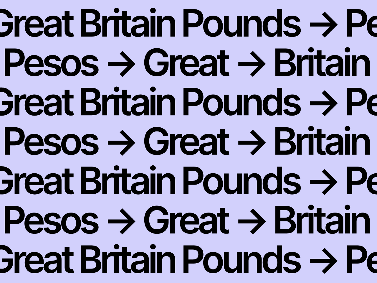
“Conversion Maze”
This “conversion maze” represents a design issue intrinsic to Chilean banking, in which our described how peso needs to be converted into US dollars to then transfer money to Europe and North America. This conversion maze, while potentially created due to regulation, still creates a longer max that can feel complicated and confusing, especially to our interviewed users. On top of this complication, the UX design within their traditional Chilean banks for the peso to dollars to pounds conversions makes this process even more arduous. The current UX flow could be better updated to articulate the transactions being made, but presently, it’s not well presented to the end user. During our interview we asked the users to perform an international transaction from their traditional bank in Chile to a bank in the UK in order to observe and surface any barriers, frictions, and positive or good design elements in the process. In our user tests, we came across a few findings including a lack of helpful UI in explaining financial terms, the traditional banks often showing the final costs of conversion at the end of the process, and other frictions and confusing design.
Some users expressed a desire for a simplified workflow, following a few buttons and getting the money almost instantly, while others had to go through a much more overwhelming process, even needing the assistance from a physical branch or bank representative concealing the complexity of all of these flows. Participants expressed a desire for tools to visualize the entire journey of their money from sending to receiving, at what point of the transfer journey is it and what are the costs to facilitate the need for third parties to have a deeper sense of the transaction’s journey and arrival. As Paulina put it, “I wish that we have the technology to make transfers of money internationally, for example from Chile to the United Kingdom this could be faster, easier not using a lot of platforms to do different things in the transferring money process.”
The Stress of Waiting for a Transaction to go Through
Waiting and No Feedback
One of the most visceral frustrations described by participants was the experience of “waiting without feedback”. As Cala put it: “there was no, like, you know, in design, where we, like, tell the users where they're at in the process. You don't have that. You input something and five days later you get the money or you don't. But there's no process tracking. So you don't know what the stages are.” On average transfers can take between 3-5 business days to complete, but users express to have no visual indication of where their money is, what stage of the transaction nor the actual expected arrival date. As Cala put it, “There’s no process tracking. So you don’t know what the stages are.” This lack of visibility, which was common in both traditional and digital banks for our interviewees, left our users feeling like they were in the dark. Our users held out hope, trying to believe that their money would arrive eventually, but they were unsure if the delays were normal. They wondered if the transfer had failed, or if it was just taking longer than they had expected.
Transfer in Progress
Your transfer is being processed. Please wait...
Day 1
Processing...
System Status
In user experience design, there is the concept of a “visibility of system status,” which is where the design shows the user at what point of the journey the user is. For example, when a user orders from food delivery services, there is a status indicator showing the user that the shop received their order, an expected delivery time, the order is in the kitchen, the rider picked it up and, finally, when the user receives their food order. In the case of international transfers, there is an absence of this feature from the financial service platforms and banks our users were using; this absence caused doubts and concerns of not knowing the transit of their money, leading to emotional stress and strife.
Chapter 6
Making Finance Inclusive, Through Design, Literacy and Understanding What to do When Harm Happens
The issues discovered in this report are multifold: how to best foster digital literacy so digital financial inclusion is achievable and banking knowledge can truly be equitable, especially for those who are marginalized or vulnerable, and what can consumers do when they encounter harmful design patterns or predatory financial services?
The barriers for design for digital financial inclusion go hand in hand with normal gaps in financial literacy knowledge for a percentage of users, including gaps that our interviewees and communities had. It's tricky to figure out how to foster that knowledge and who is responsible for furthering that knowledge. It’s hard to even understand or calculate what is enough knowledge for digital financial literacy and digital financial conclusion, especially to empower consumers with their own finances. One of our users we interviewed did not have any kind of ‘formal’ training or background in finance, and only some, like Cala, had family members who could provide some kind of foundational knowledge related to financial literacy. One participant remarked, “I don’t know how to invest really, if I’m completely honest. I’ve been hearing the word invest, but I don’t have money to invest right now.”
This points to another critical dimension of design in finance: financial literacy as a potential design responsibility. Simplifying user flows is not enough, users need interfaces that explain, contextualize, and teach financial terms, financial literacy, and deeper explanations or programs of what services their financial platforms offer. Other organizations, like thinktanks, nonprofits or educational groups, could offer training and programs to support communities, like ours, who want to learn more about financial literacy. These same programs could also help teach communities how to recognize predatory or harmful financial practices, and financial products.
In an anonymous and background conversation with a former financial regulator, they pointed out that there will never be ‘enough’ education to overcome the harmful practices that companies engage in, especially ones that are specifically designed to trick or confuse consumers. As a harmful design patterns expert, I agree with that statement. It should not be on the user alone to ‘spot’ harmful practices and users shouldn't be expected to ‘skill up’ or learn to avoid being harmed. This is where diligent regulation and consumer protections are key, so harmful practices can be combatted as they are uncovered.
Combatting Harmful Design Patterns
Our conversion brought up the phenomena of dynamic or invisible harmful design patterns, in which AI or machine learning inside of a product will get ‘specialized’ or ‘personalized’ prices, services, and products, including prices shown for that user, and specific product features. But, these ‘personalized’ editions of a product are not made clear to the user, and in some cases, one could see how a ‘personalized’ version of a product to a user includes predatory pricing, or a higher price to use that product if that user is deemed to be a high risk client. Users are not made aware of how the product is giving this specialized deal or that they might be given an unfair price. Furthermore, that ‘specialized’ edition of the product might be coming from an AI or machine learning system built on harmful and biased data that replicates bias against specific groups in our community. This unfair personalization is also a form of a harmful design pattern.
With all of this in mind, what can consumers do if they do spot a harmful design, predatory services, or other issues in a financial services platform? The former employee of a financial regulator we spoke to suggested a few things for US based consumers:
- Always check your purchase transactions to see if you were charged for something without your knowledge or consent
- If you were, you can always freeze your credit
- If something bad has happened, contact your state or federal consumer protection inspector general or attorney general.
- Consumers can also report complaints to the Consumer Financial Protection Bureau– which is still running in the US, even after facing budget cuts from the current Trump administration. The CFPB is still required by law to research, analyze and respond to complaints.
- Complain on social media! This might sound minor or petty, but brands and companies still do listen to consumers, and putting something on social media is a good way to get the company’s attention, and also the attention of journalists, and other consumers who might have the same problem you have had.
- The former employee of a financial regulator we spoke to mentioned how researchers and government officials still check social media for information about scams, harms and complaints. As a researcher, I often check social media to see what real users are saying about different types of products- that’s why there are quite a few examples in this research study from consumers complaining on Reddit!
- For international consumers, we suggest researching different financial regulators in your country, and checking different laws related to consumer protection. For example, in the EU, there is the Digital Services Act which has a provision specifically about harmful design patterns. Each country should have a financial regulator, as well as a variety of other regulators (such as privacy regulators, competition regulators, etc).
- Push for regulation and change! All consumers, no matter which country they are in, should be contacting their elected representatives to ask for more comprehensive and complete regulation to protect consumers against new types of harm and harmful design patterns.
To ensure digital financial inclusion is possible, knowledge and education has to go hand in hand with the design of platforms. Design for financial inclusion requires design with usability, accessibility, empathy, transparency and legibility. The challenge lies in designing systems that balance regulatory friction with human clarity, ensuring that users understand what happens to their money at every step of the way. Ultimately, the design of finance is the design of access, who gets to participate, who understands the rules, and who bears the cost of opacity. The future of financial design lies not only in seamlessness but in making the invisible visible: exposing the pathways, processes, and power structures behind every digital transaction in order to reduce the hidden costs this has on the users.
· ✤ · ✧ · ✤ ·
This project was made with support from the Interledger Foundation.
Like this article and want to support more work like this? Learn more about Convocation Research + Design here.